Aesthetic
We're not saying your slides should look like a Pixar movie... actually, why not?
Imagine smooth animations, vibrant colours, and a design so crisp it deserves an Oscar.
That’s the goal – and don’t worry, you’ll master the art of slide-making with help from the team.
At the very least, your slides should be clean, professional, and visually engaging –
because let’s be real, no one wants to sit through slides that look like they were thrown together in MS Paint at 3 AM.
Good design keeps people engaged and makes information easier to digest.
💡 What this means:
-
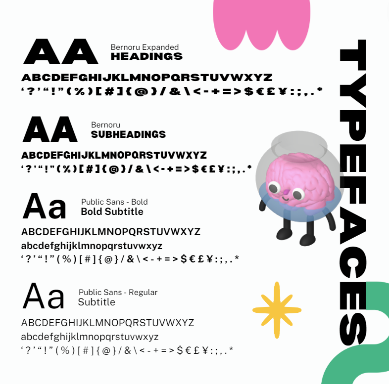
Follow the MDN branding kit – we have it for a reason.
-
Keep slides minimalist and visually appealing – the less text the better.
-
Use consistent fonts, colours, and icons – check out our Workshop Pitch Deck
for an idea of how we do it here at Education.
🔍 Ask yourself:
✅ Are my slides easy to read and visually engaging – have I included enough memes?
✅ Do they match the MDN branding kit?
✅ Would I enjoy looking at these for the duration of the presentation?
🎯 Example:
Instead of a boring title slide, make it pop with animations, bold colours, and large, readable fonts.
And please – for the love of good design – no pixelated images…
unless it’s for meme purposes 😏😈
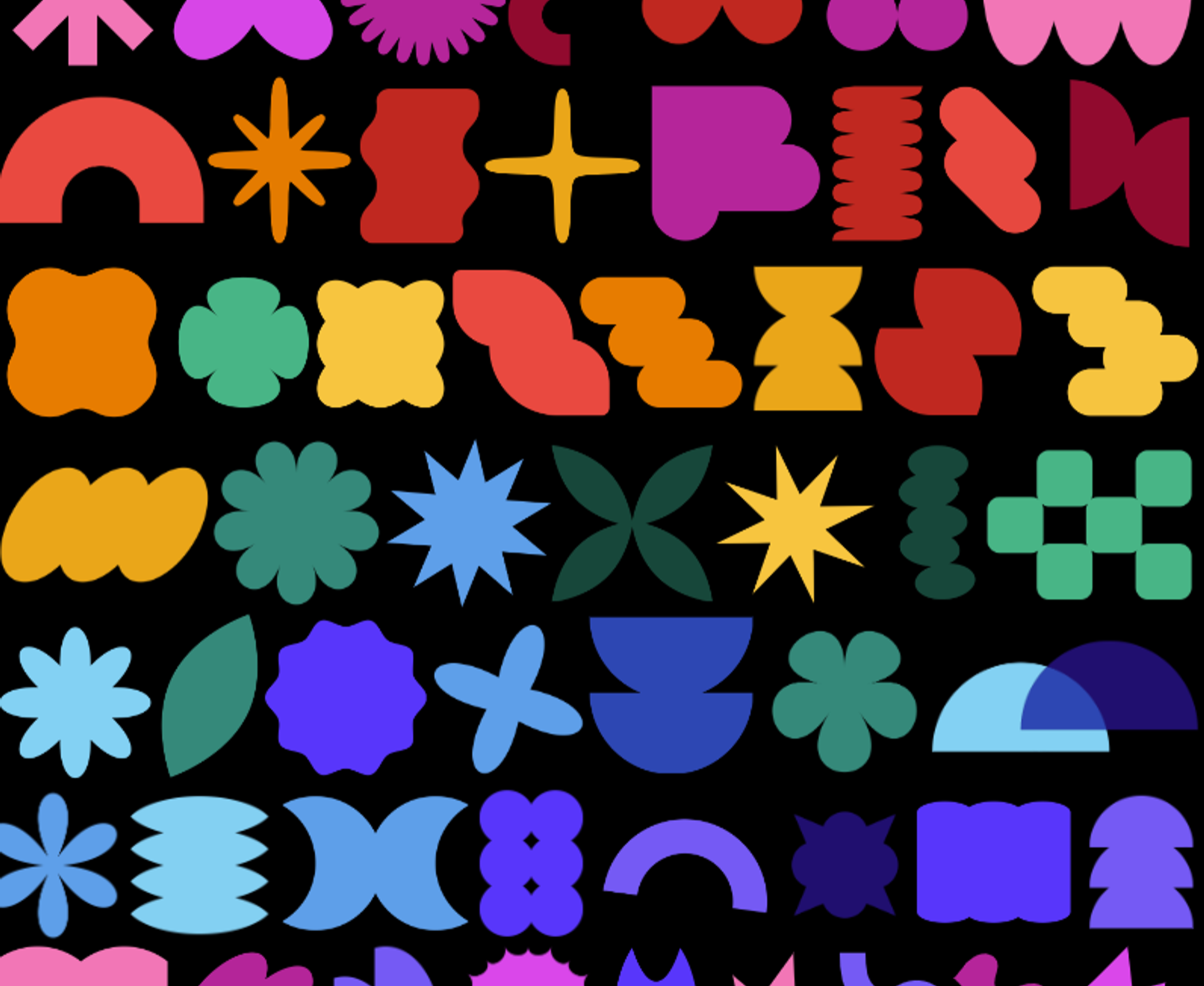
🧪 Real-world visual examples